 3
3New maps from NASA’s Dawn spacecraft reveal more about both the landscape and composition of the largest asteroid.
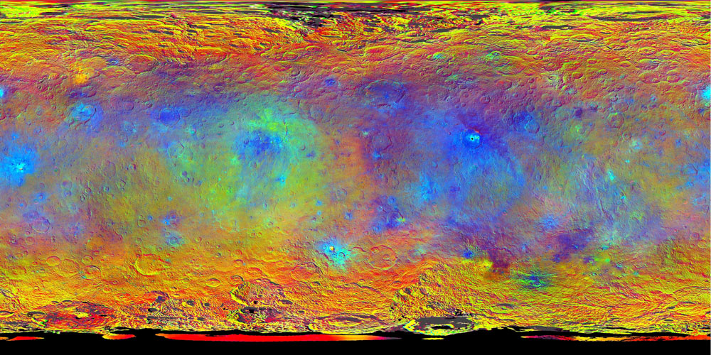
Dawn team members presented new maps of the dwarf planet Ceres today at the European Planetary Science Conference in Nantes, France. We’re still not at the point where we’re taking snazzy spectra of the surface — so no word yet on what those bumfuzzling bright spots are made of. But one of the released false-color maps does show how the surface’s composition changes across the asteroid, so we’re getting closer. Literally: in October, Dawn will begin descending to its lowest orbit around the asteroid, which is when it’ll take those long-awaited spectral measurements.
NASA / JPL-Caltech / UCLA / MPS / DLR / IDA
The team determined how the surface’s makeup changes by taking images through different filters: infrared (920 nanometers), red (750 nm), and blue (440 nm). A feature appears brightest at the wavelength at which it reflects the most light; the reddest places are those that strongly reflect infrared light. Green marks the happy medium locations, where features are very reflective at all wavelengths — in science speak, the albedo is high. One of those locations is, naturally, the bright spots in the crater Occator. That crater is the divot carved out of the big blue region to the map's center right.
NASA / JPL-Caltech / UCLA / MPS / DLR / IDA
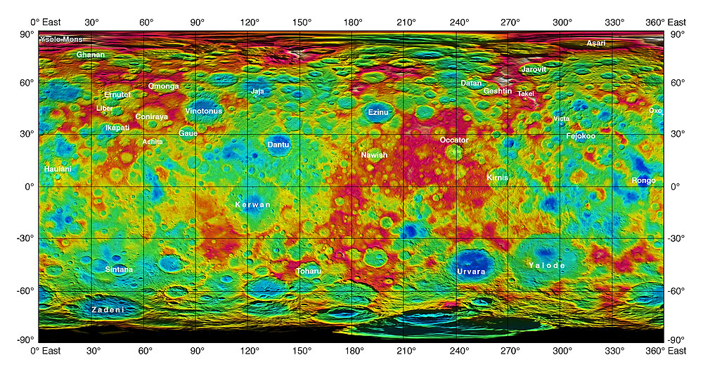
As you can see from the topographic map at right, the crater Occator lies in a highlands region and doesn’t dig as deep into the surface as other craters. What does that mean? For now, not a clue. (Bring on those spectra!) The map also has some new and approved feature names, such as the 20-kilometer-wide (12-mile-wide) Ysolo Mons near Ceres’ north pole. Ceres’ nomenclature falls into the category of agriculture-related spirits, deities, and festivals from cultures around the world, in keeping with the fact that Ceres was the Roman goddess of agriculture, grain, and (depending on the source you read) motherly love.
Like what you read? Subscribe to Sky & Telescope for science, observing, and equipment news. Respected by both amateur and professional astronomers!
About Camille M. Carlisle
Science Editor Camille M. Carlisle handles science features for Sky & Telescope. She specializes in black holes, Mars, and whatever she happens to be writing about at the time. Frolic with her through the delights of black holes in her blog, The Black Hole Files.

Comments
Robert-Casey
September 30, 2015 at 12:11 pm
Looking forward to seeing some true color hi-res pictures of Ceres (like that low resolution pix from the Hubble telescope). So far, all I've seen are black and whites, which makes Ceres, aside from the bright spots, look like a boring ball of craters.
You must be logged in to post a comment.
Anthony Barreiro
September 30, 2015 at 7:20 pm
On the topographic map, red seems to depict higher elevations and blue lower elevations. Is this correct?
You must be logged in to post a comment.
October 2, 2015 at 4:30 pm
That's correct. Fascinating to overlay the topo and false-color maps and see a glimpse into how mineral composition varies with surface features.
You must be logged in to post a comment.
You must be logged in to post a comment.