 4
4In 1983 Edward R. Tufte published an immensely influential book entitled The Visual Display of Quantitative Information. The gist of the book is that graphing data is (or should be) a sophisticated art. If you want to convey useful information to your reader, you have to think about the presentation, not just slap data on a page any which way. Tufte's main peeve is with graphs that present data inefficiently or ineffectively, so that you look at them and don't really know what they're saying. A related subject is that the same information can be presented graphically in different ways to make different points.
P. Cinzano / F. Falchi / C. D. Elvidge / Tony Flanders
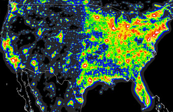
At right, I've shown a piece of the North America chart from the Light Pollution Atlas re-mapped to a conical projection. On looking at it, most people's first reaction is "My goodness, almost half of the U.S. is brilliantly lit." Whether intentional or not, that's a direct result of the colors chosen to represent different levels of light pollution. (From darkest to lightest, they're black, gray, blue, green, yellow, orange, red, and white.) The most prominent color in this map is green. That's not surprising, since the human eye is most sensitive to that color, and this is the greenest green that you computer monitor can produce, with all the green pixels firing at maximum, and all the other pixels turned off.
P. Cinzano / F. Falchi / C. D. Elvidge / Tony Flanders
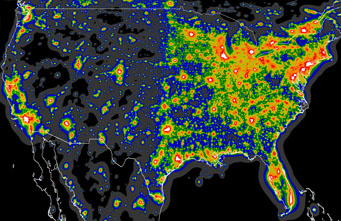
To my mind, this is somewhat misleading. Logically, the colors ought to go from darkest to brightest. But the orange zone appears distinctly darker than the green zone, belying the fact that skies are in fact 9× brighter in the orange than in the green. Shown at right is a very minor tweak, using darker versions of green and yellow. This makes the colors more of a continuum, and it's also more faithful to the underlying reality. In fact, the typical reaction of urbanites or suburbanites on first visiting the green zone is that skies are darker there than they ever imagined could be possible.
P. Cinzano / F. Falchi / C. D. Elvidge / Tony Flanders
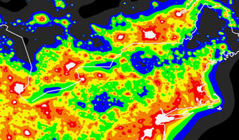
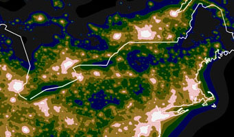
The differences may be more apparent in a closeup view. At right is an excerpt from the original map showing the northeastern U.S. and southeastern Canada. Detroit is on the left; Philadelphia and New York are near the bottom right of center; and Ottawa, Montreal, and Québec City (left to right) are above them near the top of the map. Prominently dark are the Great North Woods of Maine and the far greater woods of Canada. Less dark but also notable are the Adirondacks southwest of Montreal and the Alleghenies west-northwest of New York City. It looks as though New Yorkers have to go a long, long way to escape light pollution.
P. Cinzano / F. Falchi / C. D. Elvidge / Tony Flanders
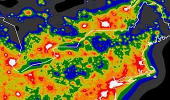
Here's the same region using my revised colors. This more or less matches my perception of the Northeast. It's now apparent that there's an almost unbroken corridor of reasonably dark sky — green at the worst — running down the backbone of the Appalachian Mountains. It's a long drive to a gray area from Boston or New York, but there are pockets of green — areas where the Milky Way is very attractive indeed — not too far away.
P. Cinzano / F. Falchi / C. D. Elvidge / Tony Flanders
Here's a more drastic representation of the same data, which would probably seem appropriate to a typical backyard astronomer with little experience of dark skies. I've cranked green and yellow way down so that they look almost dark and boosted red to be a shade of white. Now the main contrast is between areas where the Milky Way is prominent (yellow and darker) and areas where the Milky Way is faint or invisible (red and white), with orange as a transition zone. This would be my guide if looking for a weekday observing site, where long drives are out of the question. Ideally, I would head for yellow or green, but in practice, I would just try to get out of red or white.
Which of these versions matches your perception of the light pollution around you?
About Tony Flanders
Contributing editor Tony Flanders has been working with S&T in some capacity since 2003.

Comments
Sebastia Torrell
June 19, 2009 at 5:12 pm
yes
you are reason !
but, the green area code defines a zone about luminical pollution is like the frontiere for a nocturn paisage is about turnaround from rural to suburban ilumination.
Is a critical zone.
( I believe what the alert from this areas is the reason for a major visibility in the map )
You must be logged in to post a comment.
jeff
June 19, 2009 at 11:54 pm
Several illustrations are missing from this online article.
You must be logged in to post a comment.
snowstargazer
June 20, 2009 at 7:16 am
I like and agree with what you have done to the charts.
One should be able to alter the color scheme to black and white and find that the whitest areas have the most light scatter and the blackest areas have the least, with the shades of gray forming the transition zones. After all, light is what is being represented.
Apparently the colors on the chart were chosen arbitrarily and give a very poor representation of how much light is scattered through each area. I believe that in color theory the property I'm referring to is called "value", high values are brighter than low values. The light pollution hot spots should be high value colors, darkening (lower values) towards the black.
I hope that the charts will be corrected to include your accurate insight.
Observers, remember that blocking out any nearby light source helps quite a bit. Nearby lights will contract your pupils and prevent you from seeing the detail that is available at your site. Moving so trees or buildings block out the light source (even the moon) will help, as will setting up a barrier. I've use a stepladder with a tarp thrown over it to cut out a single light source, with noticeable results.
You must be logged in to post a comment.
Prometheus
June 22, 2009 at 6:37 am
I think you make a very good point here, Tony. Choices about presentation of data are made as part of an overall attempt to communicate both facts and analysis. The choices made will refelct the agenda of the presenter.
With the original maps, it appears that at least part of the agenda was a desire to convey alarm over extant levels of light pollution. This is a valid concern, but alarm can easily slide into discouragement and fatalism.
Using myself as an example, despite my interests in stars and cosmology I never bothered to pursue backyard astronomy bcause I (wrongly) assumed that it would be pointless - why bother?
I prefer your rendition of the map - it expresses concern, but gives an impression that all is not lost. I would love to see it published as a downloadable chart; it would be useful for vacation planning.
You must be logged in to post a comment.
You must be logged in to post a comment.