 4
4This year’s solar physics communication prizes recognize two pieces from Sky & Telescope magazine.
In a delightful surprise to our editorial staff, Sky & Telescope’s authors have swept up two of the three science communication awards conferred this year by the Solar Physics Division (SPD) of the American Astronomical Society.
The award for a science writer goes to News Editor Monica Young, for her November 2020 feature “To Touch the Sun.” The award for a scientist goes to Contributing Editor Monica Bobra (Stanford University) for the September 2020 infographic “Crossing the Edge of Our Solar System,” which she created with illustrator Nicolle R. Fuller (Sayo Studio).
Each year, the SPD Popular Media Awards Committee considers a wide range of science journalism pieces, looking for the best stories about the Sun or its effects on Earth’s environment. You can find a list of past winners here. (Although S&T is part of the AAS, we maintain a strict policy of editorial independence, and our science journalism is judged accordingly.)
But instead of merely touting our own horn, we thought our readers might enjoy a peek into how these stories came into being. So here, we’ll take you behind the curtain for a glimpse of how we create S&T.
What the Voyager Spacecraft Encountered
The story of the infographic “Crossing the Edge of Our Solar System” begins with the Voyager spacecraft. Both craft have now passed the edge of the solar system — or, more precisely, the heliosphere, the magnetic bubble surrounding the Sun and its planetary family. But what exactly did the spacecraft encounter? What does it mean to leave the solar system?
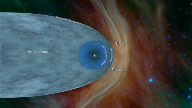
NASA / JPL-Caltech
In January 2020, Bobra started talking with S&T Science Editor Camille Carlisle about how to explain the Voyagers’ adventure to readers.
“We use so many terms to describe magnetic fields throughout the heliosphere — like ropes, pipes, islands, barriers, and clouds,” Bobra says. “It’s difficult to visualize what these actually look like. That’s why I wanted to go for a data visualization instead of a traditional feature article. I wanted readers to see how two satellites could leave the bubble of our solar system and still experience totally different magnetic conditions.”
Over two months, Bobra (a solar physicist) dove into the research papers, immersing herself in what scientists had expected to see versus what they actually saw, and how those data changed scientists’ understanding of the heliosphere. “In reading all these papers, I ended up with a lot of questions about the magnetic barrier observed by Voyager 2,” she says — so many questions, in fact, that she reached out to colleagues to help her investigate. They ended up discovering something new: The barrier in this part of the heliopause enabled energetic, charged particles to cross the heliopause, instead of blocking them. “We ended up writing a paper on that!”
Bobra drew a sketch synthesizing her research and provided it to Carlisle and S&T Art Director Terri Dubé, along with a caveat: We shouldn’t illustrate this in a way that implies every detail is absolutely true. “Extremely graphic illustrations can lead readers to believe all the little details — like subtle variations in color and dimension — represent real scientific knowledge,” Bobra explains. “But in reality, we don’t know this level of detail.”
Based on that guidance, Dubé suggested a “chalkboard” look, to convey visually that this scientific field is a work in progress. “We even added eraser marks to suggest the idea of iteration and working through a process,” she says.
Dubé reached out to illustrator Nicolle Fuller to recreate Bobra’s sketch. “In addition to her beautiful illustration skills, Nicolle also includes technical research in her process, and that is invaluable,” Dubé explains. “This allows us to further brainstorm any technical details that may arise during the design process.”
Fuller created the first illustration in May, and after a few weeks of back and forth, the four finalized the infographic in June and sent it to press in the September issue.
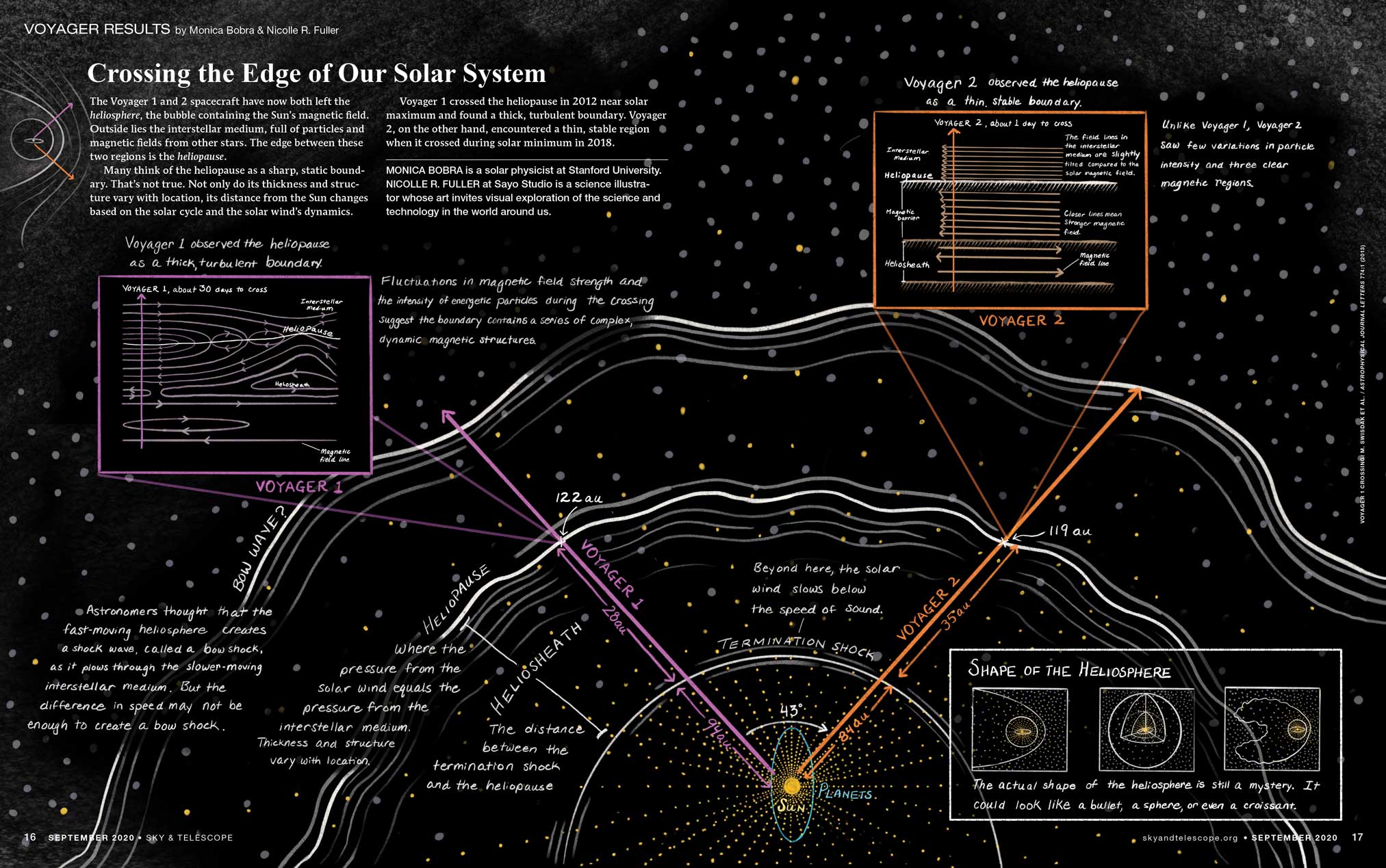
Monica Bobra and Nicolle R. Fuller
To Touch the Sun
Young’s feature “To Touch the Sun” began in Hawai‘i — not on a beach, but in a conference room. She and Carlisle were looking to commission a feature on NASA’s recently launched Parker Solar Probe, and for ideas Young attended presentations by the science team at the 235th meeting of the American Astronomical Society in Honolulu. “The preliminary results they were presenting were so exciting — and there was still so much more to come,” she says. “I knew then that I wanted to be the one to write this story.”
Young soon followed up back in the Boston area and was hooked by the captivating (and hilarious) stories told by Justin Kasper (University of Michigan) during a talk at the Center for Astrophysics, just down the street from S&T’s office. She also arranged a tour of the Solar Probe Cup lab with Kelly Korreck (Center for Astrophysics, Harvard & Smithsonian) in early March 2020 — “just in the nick of time,” Young says.
“COVID-19 was creeping up on us,” she explains. “I remember foregoing handshakes, and Korreck offered me hand sanitizer.” It was here that Young saw the warped and corroded pieces of discarded refractory metals researchers had tested while trying to find something that would survive near the Sun.
The very next week, COVID lockdowns commenced in the Boston area. Young conducted the rest of her interviews by Zoom and wrote the article from home with her husband and three kids. “My daughter’s daycare was closed, and my two young sons were in virtual school, so there were many late nights,” she admits. “But also moments of peace and laughter during the day!”
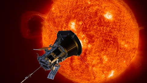
Carlisle helped Young do some sprucing of the wording, and then Young worked with S&T Illustration Director Gregg Dinderman to create the article’s diagrams. She and Dubé picked an opening illustration that conveyed “Parker’s temerity” in approaching our fascinating but hostile Sun, Young says. Dubé then built a visual story around Young’s words.
“The inspiration for this design was to make the reader feel immersed in the opening image,” Dubé explains. She then grouped the photos and illustrations to visually highlight key elements of the story — first, what Parker looks like and where it was going; second, the probe’s components and hardware; and third, graphics to illustrate the harsh conditions that the hardware would have to survive. “This organization of visuals helps the reader make connections between different pieces of information and more easily visualize the complex concepts in play.”
The completed article went to press in August 2020 and appeared in the November 2020 issue.
And there’s your peek at how we create Sky & Telescope’s award-winning content. Congrats to the two Monicas! You can explore Bobra’s infographic here and Young’s feature here.
And if you’d like to support our science journalism, please consider subscribing to Sky & Telescope. More subscribers mean more resources to create great stories like these.

Comments
Yaron Sheffer
May 6, 2021 at 2:12 pm
Congratulations to both! Monica must be a lucky name 😉
You must be logged in to post a comment.
Anthony Barreiro
May 6, 2021 at 2:19 pm
Congratulations! I'll take this opportunity to say how much I appreciate Dr. Young's writing. She always finds the perfect metaphor that helps an astronomical phenomenon make sense in terms of our everyday lives here on Earth. And the illustrations in Sky and Telescope magazine are always engrossing.
You must be logged in to post a comment.
Anthony Barreiro
May 6, 2021 at 4:03 pm
It is very cool that researching an illustration for a popular publication led to a scholarly publication that clarified our understanding of the heliopause.
You must be logged in to post a comment.
Monica Young
May 10, 2021 at 9:37 am
Thank you very much!
You must be logged in to post a comment.
You must be logged in to post a comment.